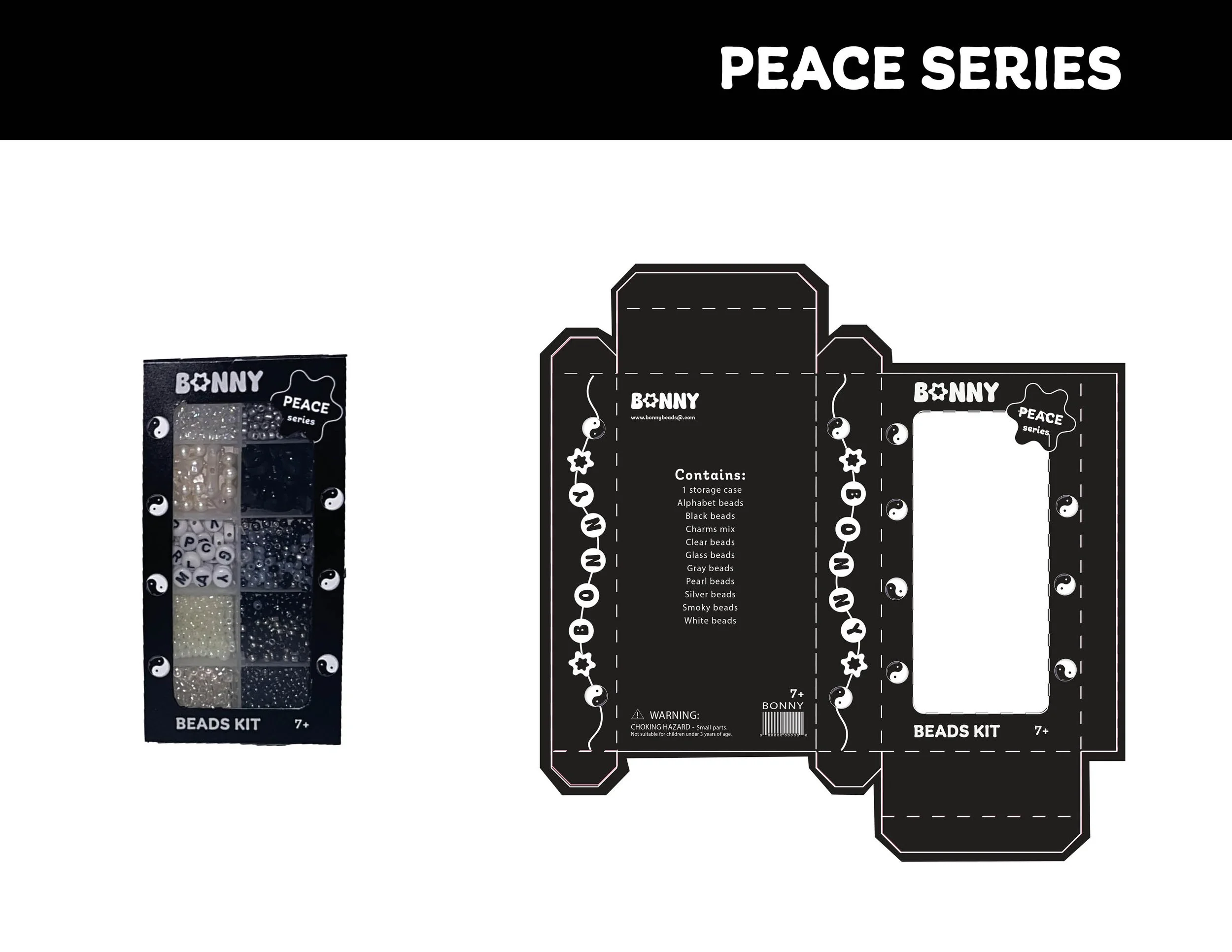
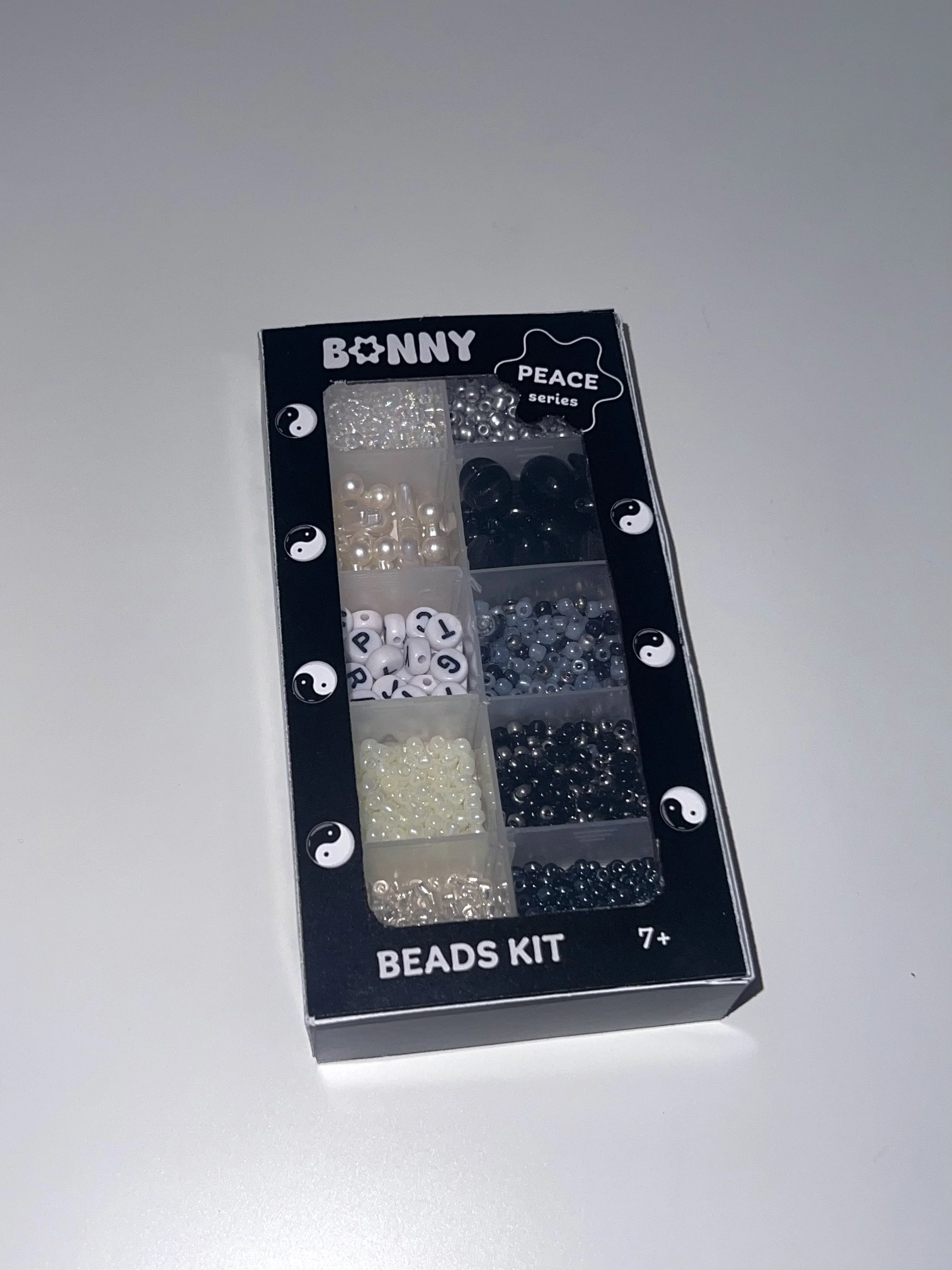
Beads Kit Packaging

For this project, I developed a playful and meaningful packaging design for Bonny, a DIY bead kit brand inspired by my childhood passion for making friendship bracelets and jewelry. The name "BONNY" comes from my childhood nickname “Bon Bon,” I wanted that to be my connection to the brand.
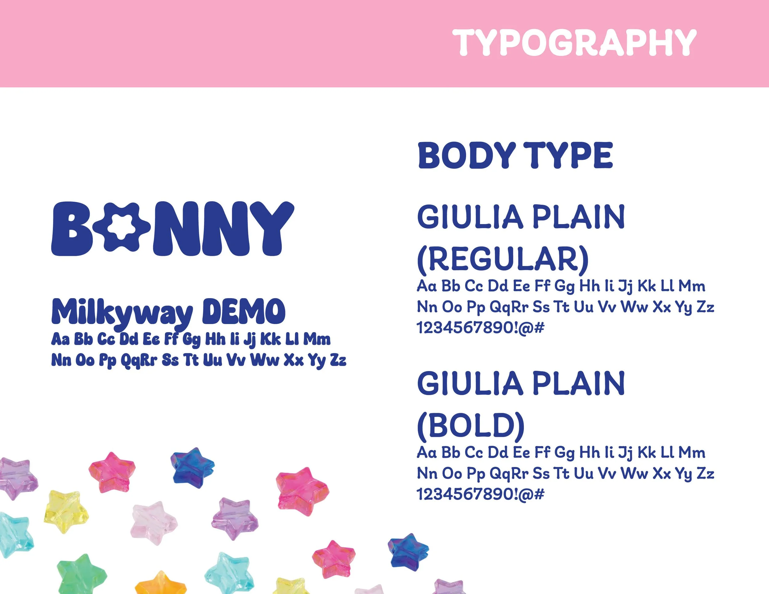
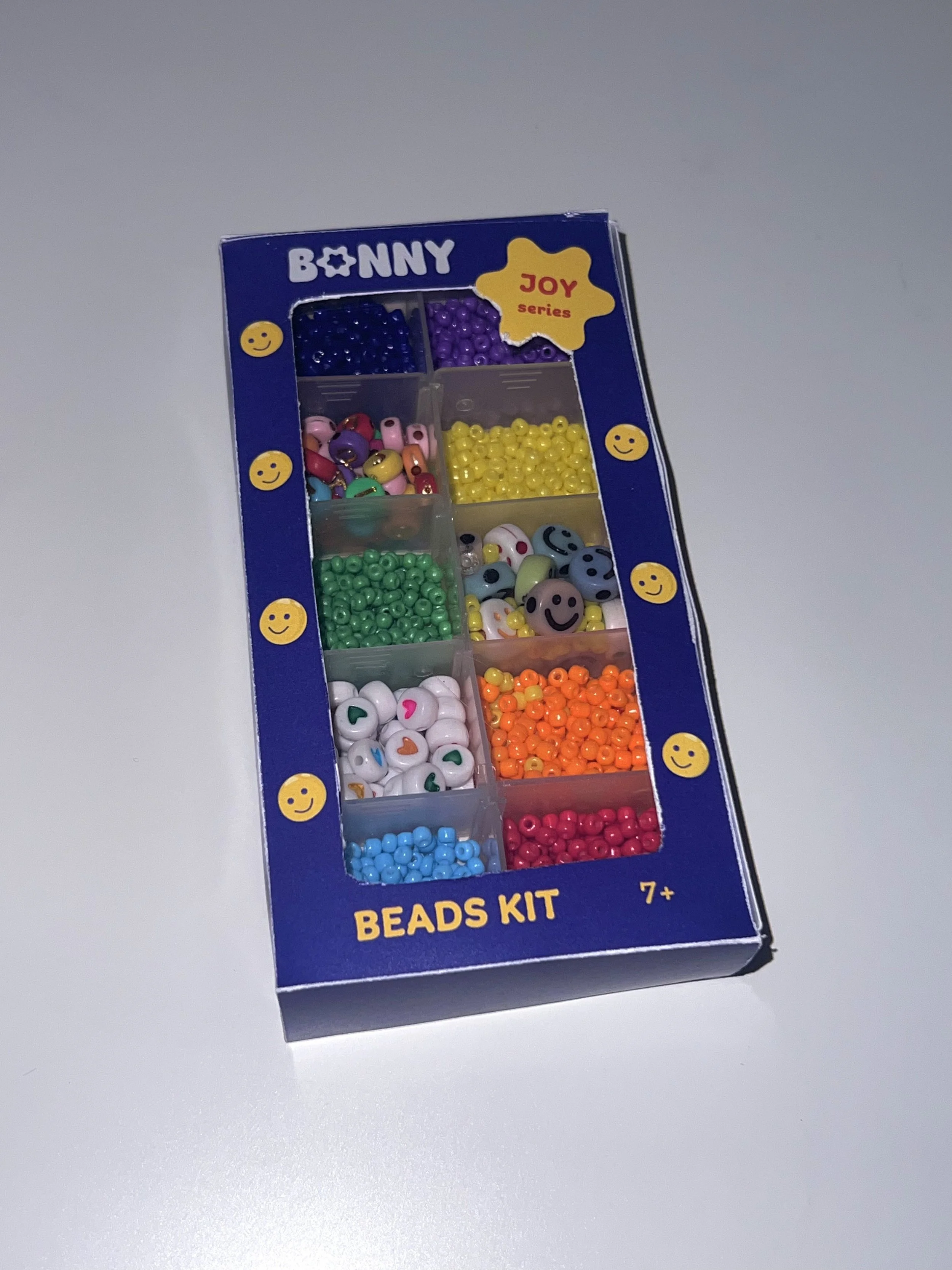
The BONNY logo uses a rounded, cheerful typeface that reflects the brand’s wholesome personality. A standout feature is the star-shaped bead charm that replaces the “O” in BONNY, adding a whimsical and playful element that reinforces the product's focus on fun and creativity.
Each package has a die-cut window on the front to showcase the beads, allowing customers to preview the product inside. The BONNY logo is prominently placed at the top, and an age recommendation (7+) is displayed at the bottom to ensure age-appropriate engagement. Side panels feature a bracelet illustration spelling out “BONNY,” styled according to each theme’s palette, adding to the charm of the design. The back panel is consistent across all packages, containing essential product information, a QR code for digital engagement
Packaging system
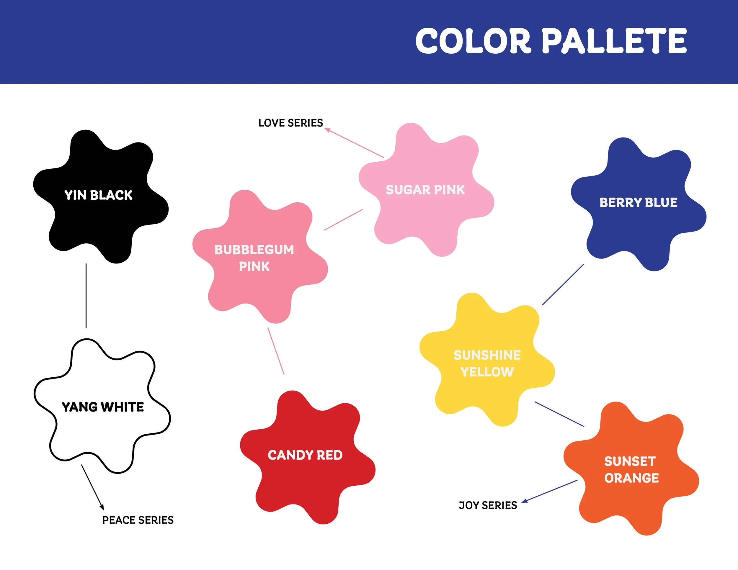
The packaging system includes three themed series: Peace, Love, and Joy, each with its distinctive color palette and visuals:
● Peace: Features vibrant blues, yellows, and oranges, with smiley bead charm illustrations
● Love: Uses romantic shades of red and pink, paired with heart-shaped bead icons to
● Joy: Embraces a monochromatic black-and-white scheme with yin-yang bead illustrations