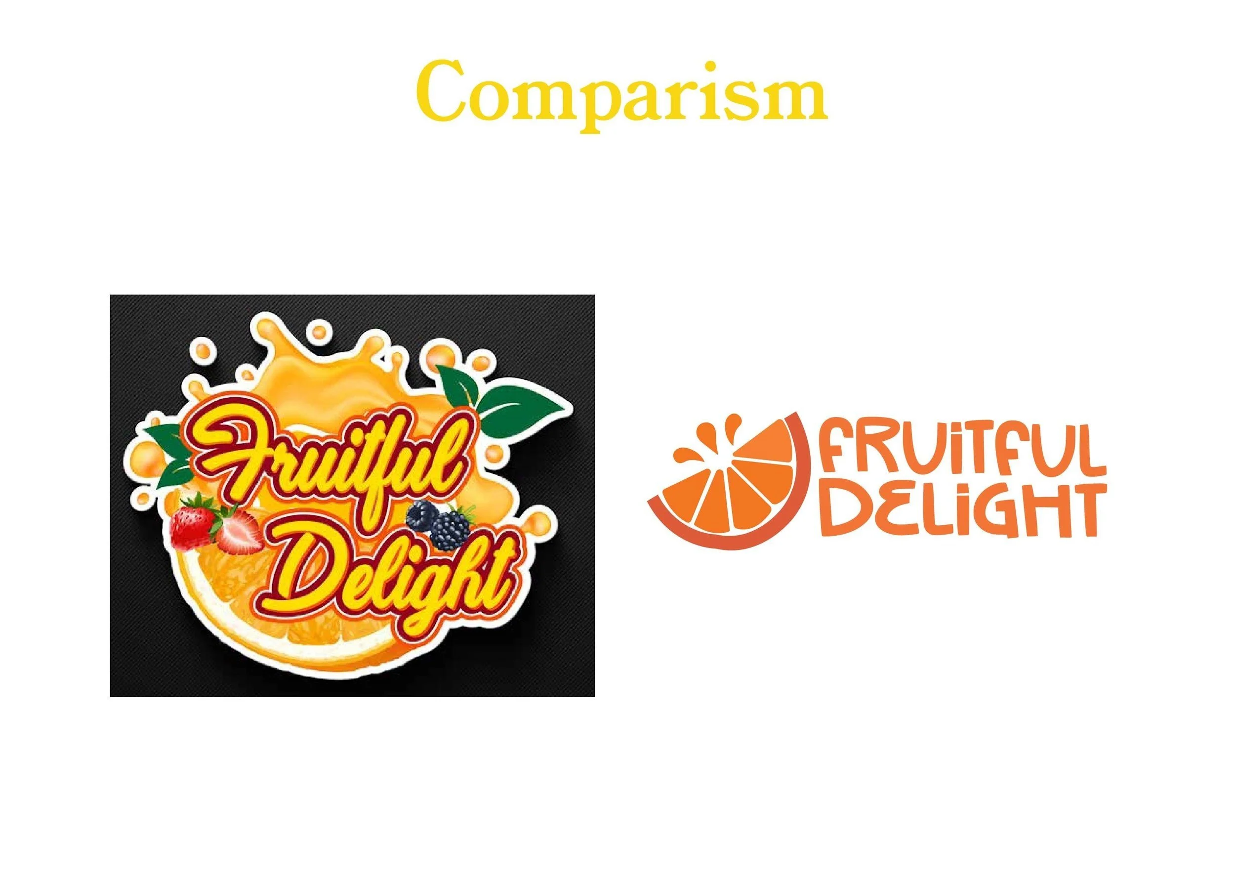
Fruitful Delight Logo Rebrand
The original Fruitful Delight logo was overly complex and visually overwhelming. As I approached this rebrand, my goal was to align the new design with the store’s aesthetic, which was clean, modern, and fresh.
In rebranding the logo, I focused on Fruitful Delight’s brand personality: welcoming, energetic, youthful, and friendly. I wanted the logo to feel fresh and juicy, complementing the store's name and vibe. The simplified color palette of just two colors enhances the design, while the typography introduces a playful touch. The result is a logo that truly represents Fruitful Delight’s juice bar, making it more visually appealing and brand-appropriate.
Process
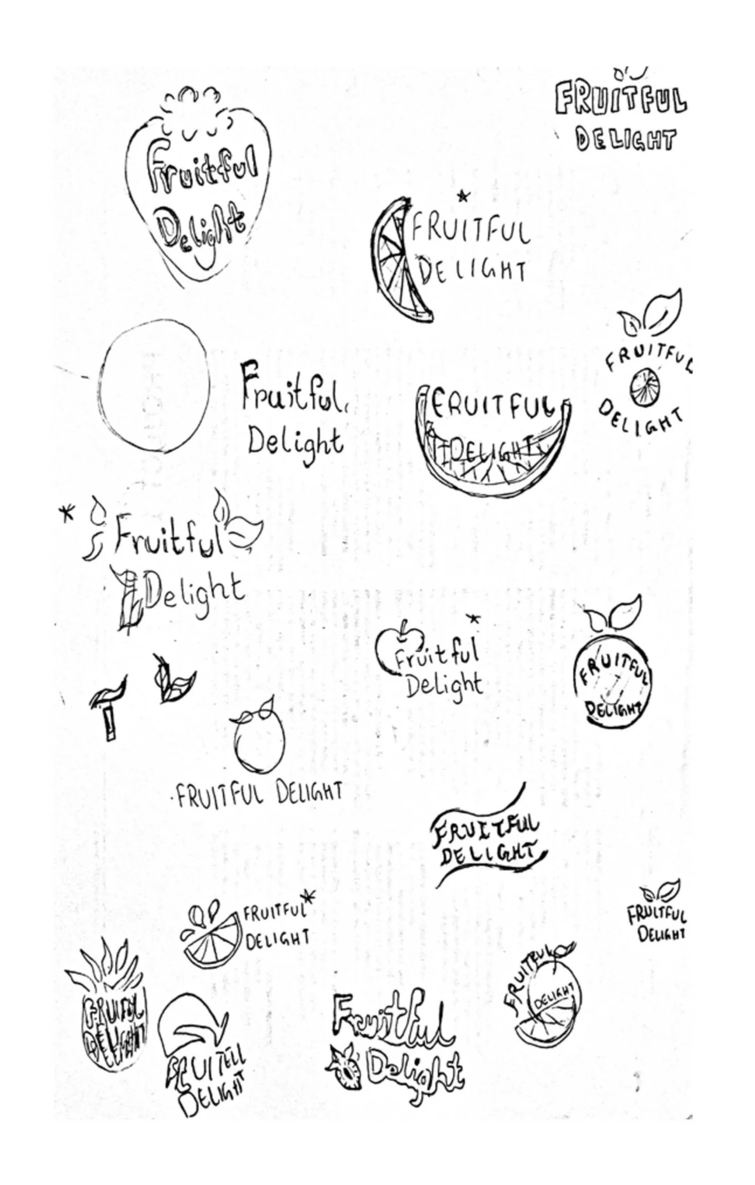
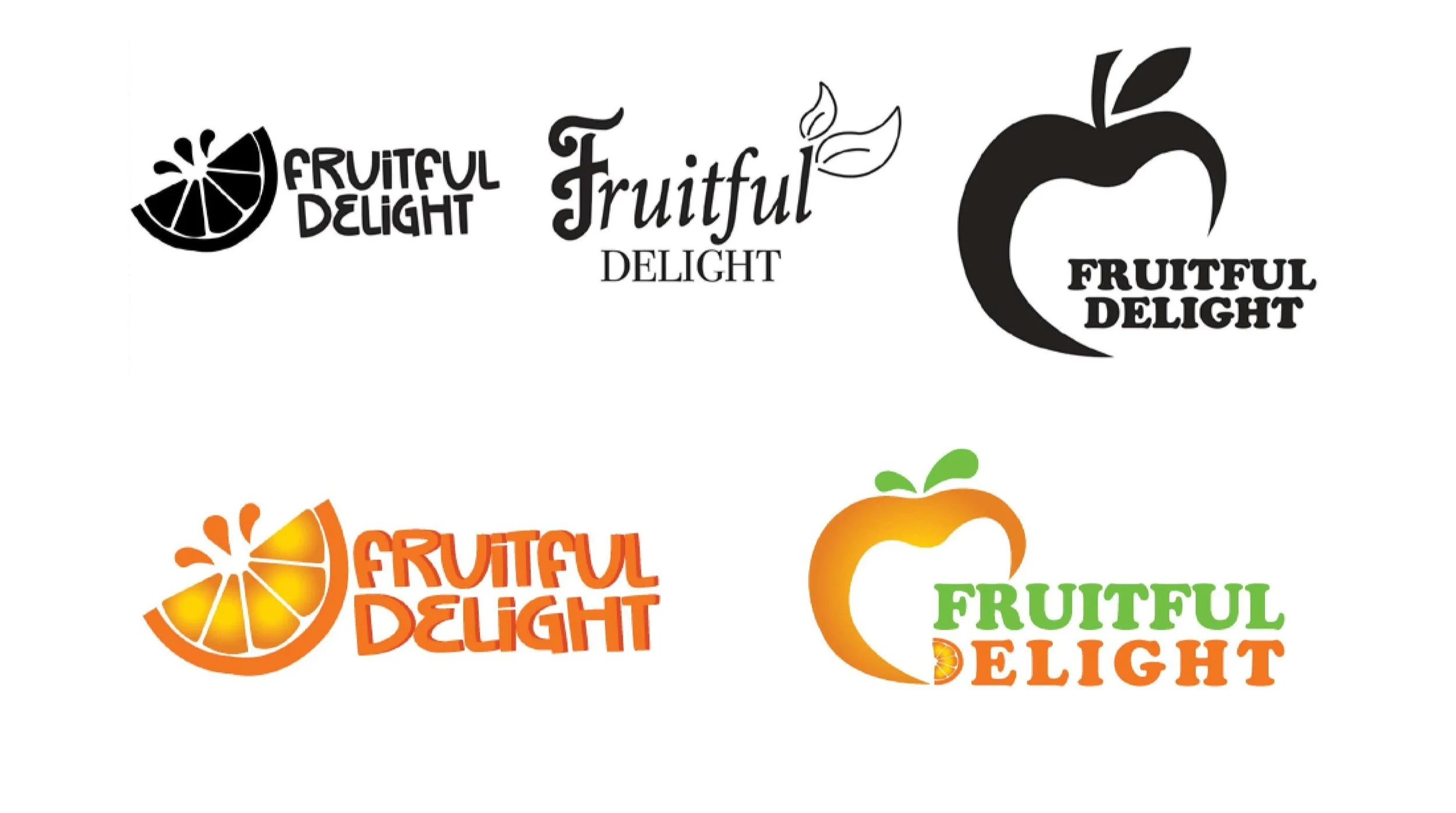
Initial Sketches and Concept sketches